Case Study 02 — CDM
CRO Landing Page Design
I designed a promo landing page and post-conversion thank-you page for a new home improvement client, resulting in a Cost Per Lead reduction by ↓60% and an increase in lead count by ↑230%.
Clever Digital Marketing had just acquired Continental Siding, a home improvement company serving homeowners aged 50–85 across the US. I partnered with our head developer to study their existing site and design a new paid search landing page from the ground up.
* Designed in Figma; built by our Head Developer in WordPress (CSS & JavaScript).
View live pageRole
Senior UX/UI Designer
Year
2026
Duration
2 weeks design, 1 week dev
Team
Head Developer, Integration Specialist, Senior Marketing Manager, Media Buyers
Deliverables
User persona, journey map, style guide, multi-step form prototype, search landing page, thank-you page
The Challenge
Adapt a proven framework, don't just duplicate it
Our Search Engine Marketing Managers asked me to reuse a framework I'd previously used to design a high-performing landing page for another client. The structure was proven — but duplicating it without thoughtful adaptation risked misalignment with Continental's brand tone and the trust expectations of older homeowners making high-stakes home improvement decisions. The challenge was to preserve what already worked while adapting the experience to a new client, industry, and set of user anxieties, without sacrificing accessibility or conversion performance.
Voice of the User
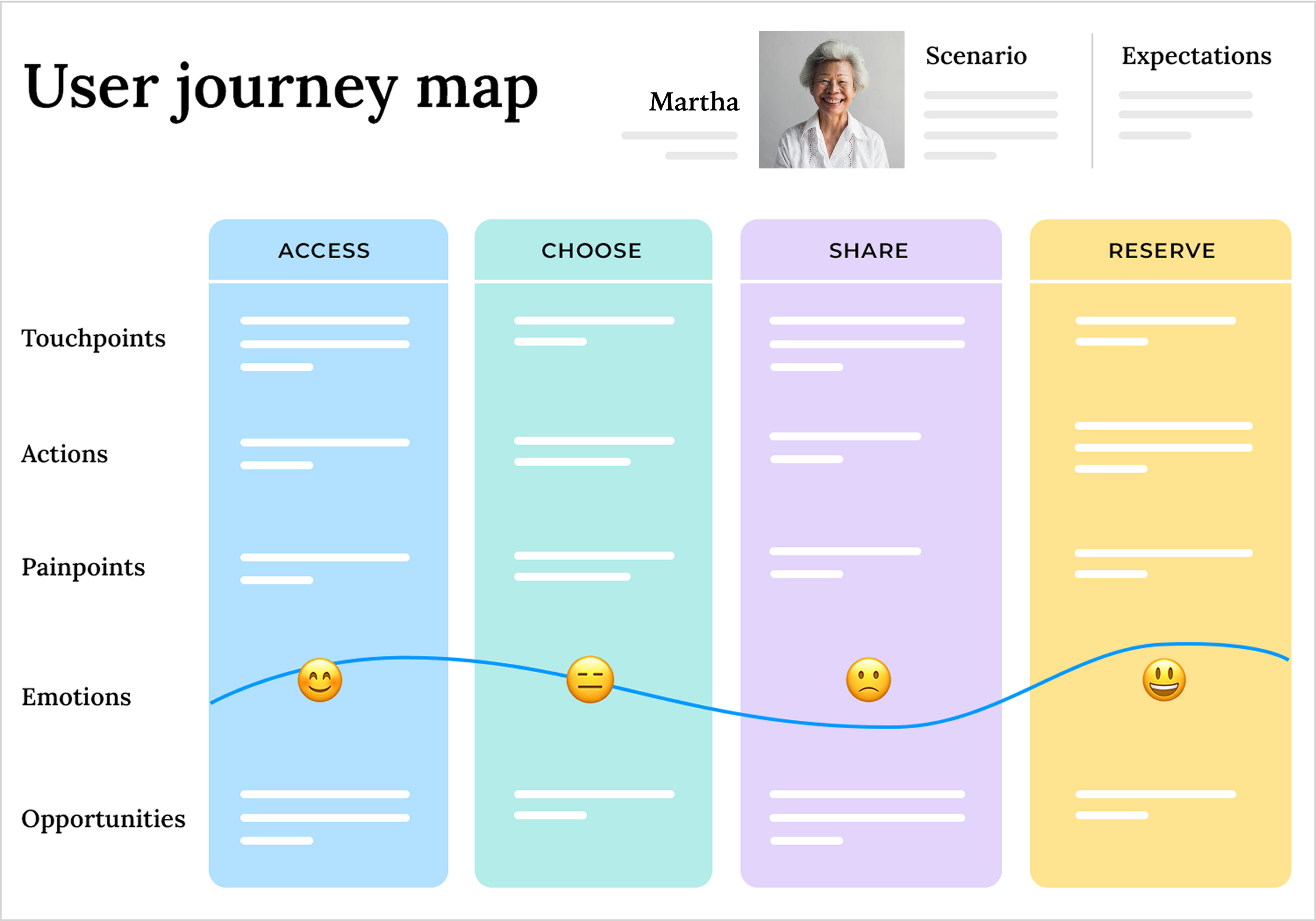
Meet Martha, our persona
A 60+ homeowner and high-intent searcher. These insights came from reviewing homeowner reviews, analyzing industry feedback, and mapping a simplified user journey to identify moments of hesitation before conversion.
Concerned about workmanship quality and accountability after the job is completed.
Easily overwhelmed by complex or dense forms.
Skeptical of stock imagery and exaggerated claims — wants real proof of completed work.
Looks for a local company with a good reputation and clear answers about warranty and what happens after the build is done.
Key Decisions
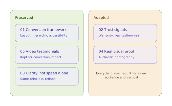
5 decisions that shaped the design
01
Preserved a proven conversion framework
Retained layout patterns, content hierarchy, and accessibility principles that had already performed well for a 50+ audience.
02
Adapted trust signals to the home-improvement context
Highlighted warranty information, post-installation reassurance, and placed real customer testimonials near conversion points.
03
Designed for clarity and ease, not speed alone
Built a large-type, mobile-first multi-step form with clear labels, generous spacing, and minimal required input to reduce cognitive load.
04
Used real visual proof instead of stock photography
Showcased authentic project photography and real customer testimonials to reinforce credibility and transparency.
05
Retained video testimonials intentionally
After reviewing performance data and industry benchmarks, video testimonials were selected over static quotes due to their higher conversion impact.
Impact & Recognition
Cost Per Lead down 60%
lead count up 230%
within 10 days of launch
Senior Marketing Manager feedback
“Lead count is up 230%, and cost per lead went down by 60% ($607). I wouldn’t say the landing page redesign is responsible for everything — there were other optimization factors at play — but I’m confident the redesign was a huge contribution.”
Design patterns from this project — including the landing page framework and post-conversion thank-you page — were later reused across additional home-improvement clients, validating the durability and scalability of the solution.
Process
Process, in brief
Discovery
- Reviewed requirements and constraints with SEMs and the Head Developer
- Created low-fidelity wireframes to validate layouts and section hierarchy
Design
- Built a brand-aligned style guide from Continental's existing fonts, colors, and interaction patterns
- Designed and prototyped a multi-step form, including error, disabled, and active states
Delivery
- Collaborated closely with development and integration to balance UX intent with technical feasibility
- Iterated on designs based on stakeholder feedback prior to WordPress implementation
Outputs
What shipped
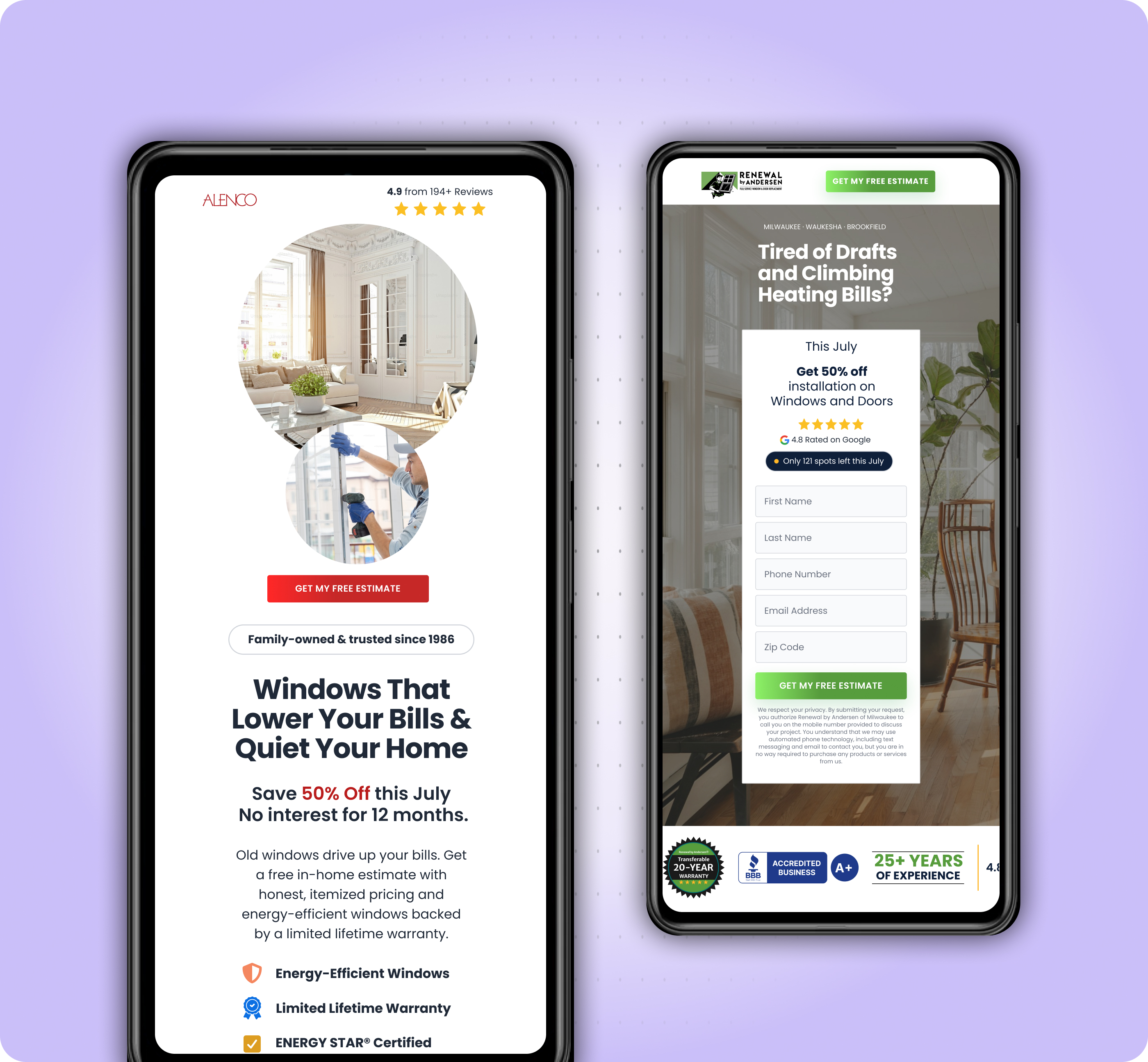
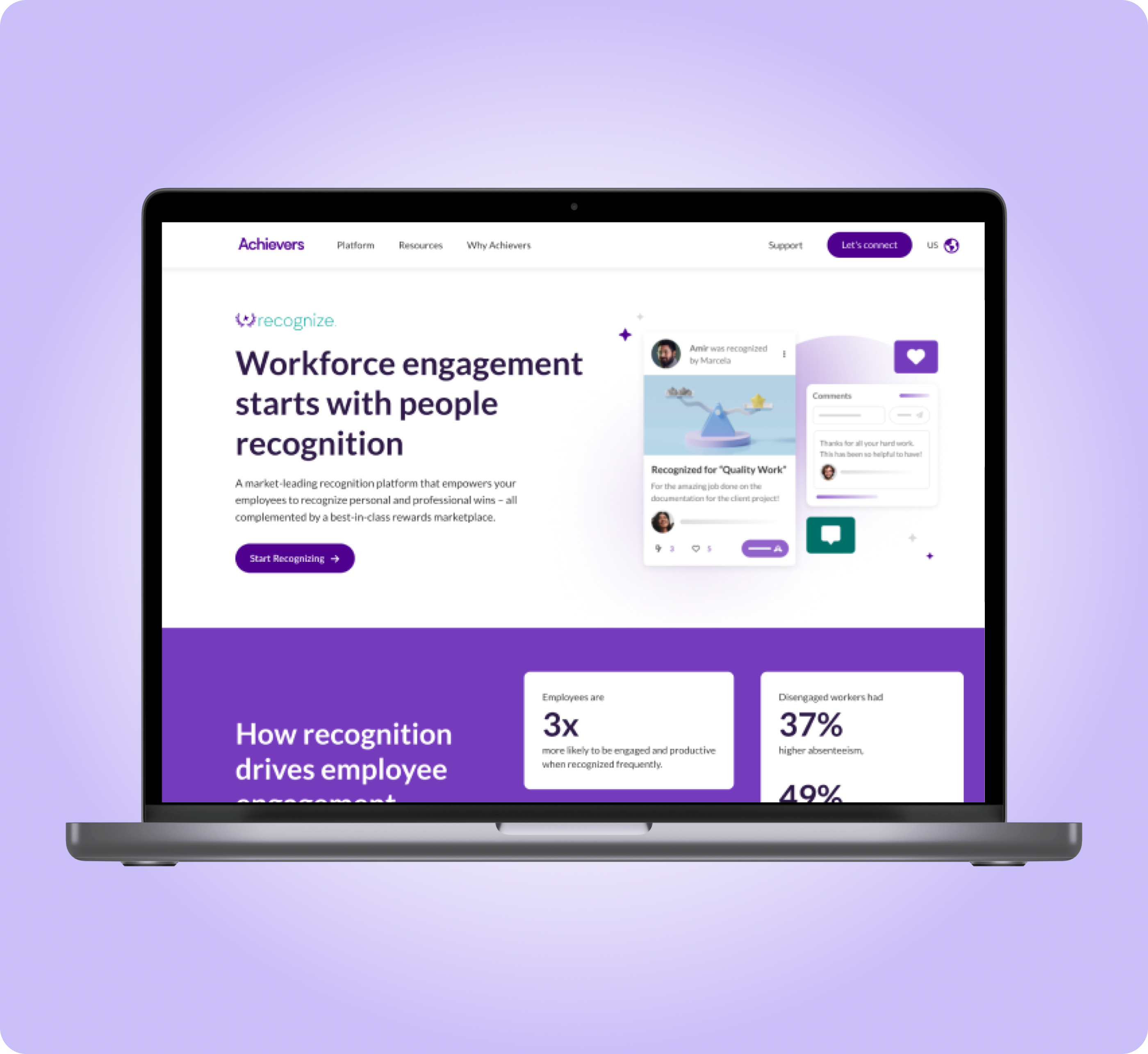
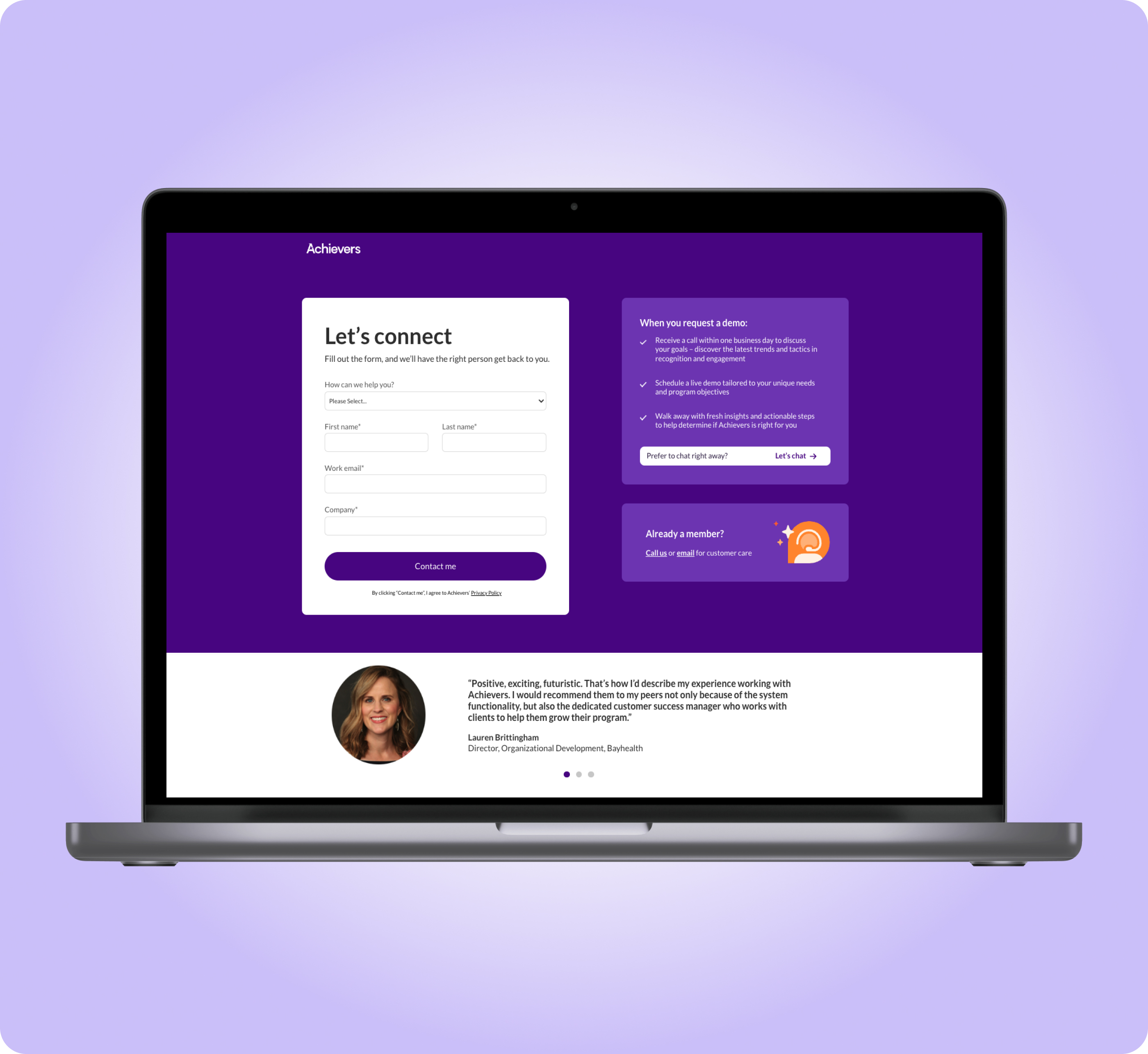
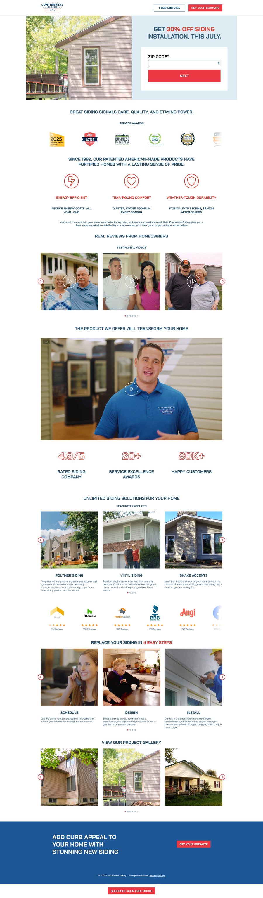
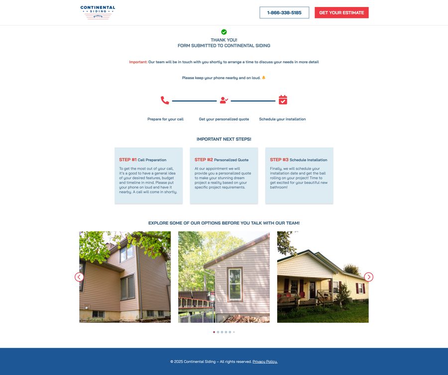
Here's a screenshot of the finished landing page and thank-you page.
Landing page — Desktop

Landing page — Mobile
Thank-you page — Desktop
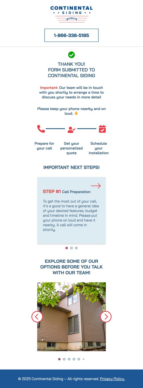
Thank-you page — Mobile
Outcome
What the redesign delivered
Strong conversion performance from high-intent paid search traffic
Improved lead quality and consultation follow-through
Positive feedback from stakeholders and the client
Design patterns reused across future home-improvement clients
Post-Conversion UX
Here's where it's at today
Instead of treating form submission as the end of the experience, I designed a purpose-driven thank-you page focused on improving lead follow-through. For a 50–85-year-old audience, missing a consultation call was a common drop-off risk. The page reinforced next steps (keeping phones nearby and on ring), surfaced real project imagery to sustain interest, and reduced anxiety while users waited for outreach. This pattern improved lead stickiness, reduced missed calls, and was later reused across additional clients.
Reflection
Why this project matters
This project demonstrates how I evolve proven conversion systems rather than duplicating them blindly — preserving accessibility and performance while adapting brand alignment, trust signals, and post-conversion UX to meet real user needs.
Co-Founder feedback
“This landing page is doing amazing. We have never seen this conversion rate on any other landing pages so far.”
Peter — Co-Founder, CDM