Case Study 04 — Quicken
Sign Up & Onboarding Improvement
Created UI consistency for Quicken Deluxe and simplified onboarding screens to ease the complexity.
Quicken used two brand colours and UI treatments for their new and old products, which confused users, and their sign up & onboarding process relied on complex screenshots that leaned too heavily on the user's memory. This was a passion project — I teamed up with another designer and together we built a case to improve Quicken's brand consistency, sign up & onboarding process and redesign their dashboard.
* Quicken is a personal finance software serving US and Canadian users.
Role
UX/UI Designer
Year
2025
Duration
2 months
Team
UX/UI Designer (me), Product Designer
Deliverables
UX evaluation, competitive research, user research, user flow, mockups, prototypes, hi-fi design
Discovery
We ran a UX audit and noticed 3 major issues
01
Brand Inconsistency
02
Poor sign up process
03
Complex onboarding and adoption Flow
Problem 1
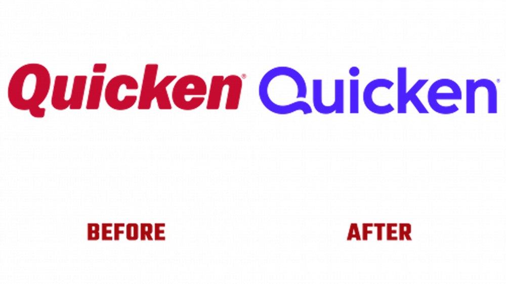
The blue and red logos created confusion about which product users had
Quicken's brand colour used to be red. Once they launched Quicken Simplifi — a lighter, web version of the software — they rebranded to blue, but kept red for their original product, Quicken Classic. Users didn't know the difference between the two products, but experienced limitations and sync issues once they started using them.
Confusion for Canadian users
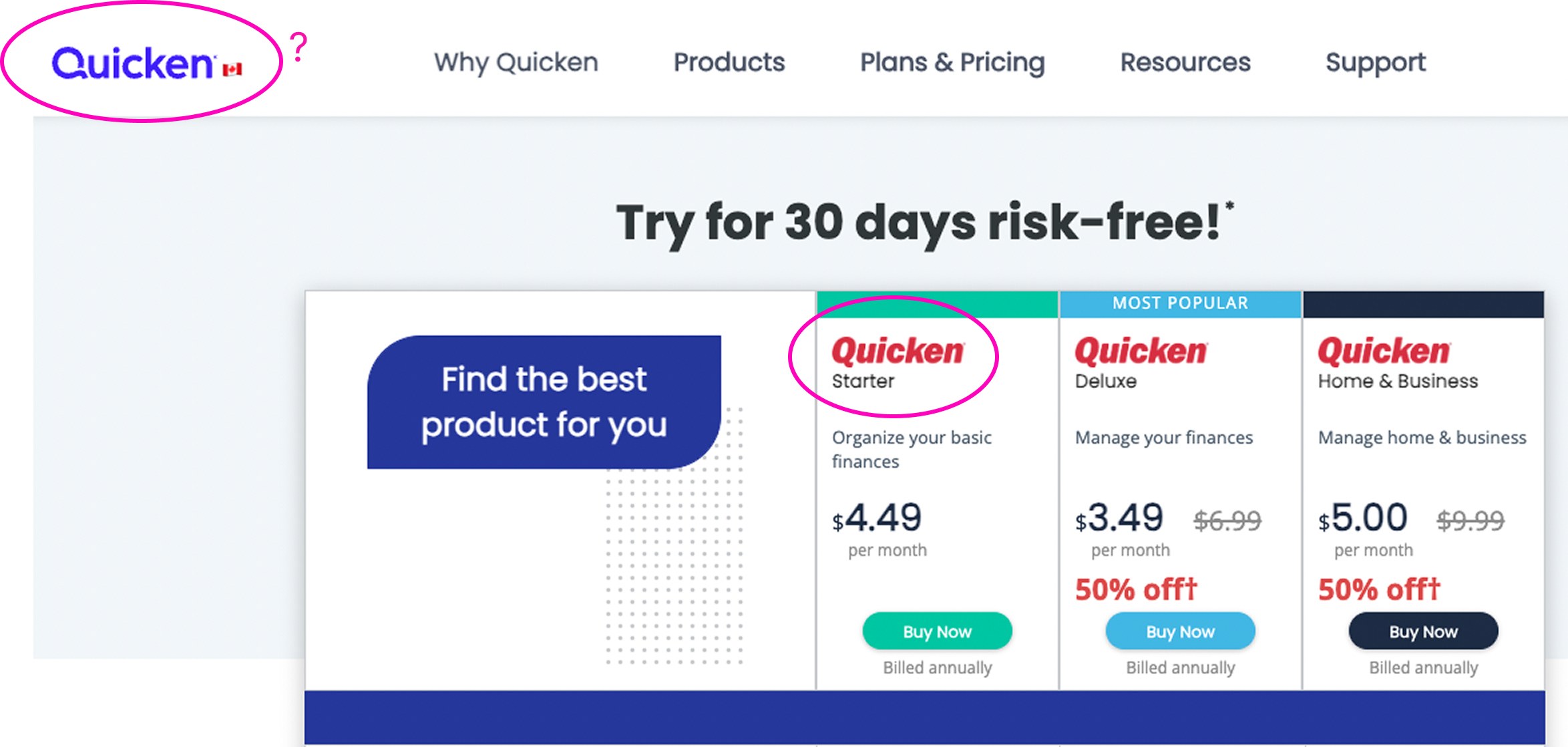
Quicken Classic was the only version available to Canadian users. However, the website used UI design elements from the new version (Quicken Simplifi) while advertising packages from Quicken Classic — showing the Quicken logo with two different UI treatments and interrupting the new user's flow.
⚠ Blue logo, but red package names — confusing for a Canadian user choosing a plan
UI Solution
We used the new brand logo and UI treatment everywhere
We used the package names to differentiate Quicken Classic from Quicken Simplifi, and added appropriate details about the benefits of each package — creating an improved offer page to introduce them.
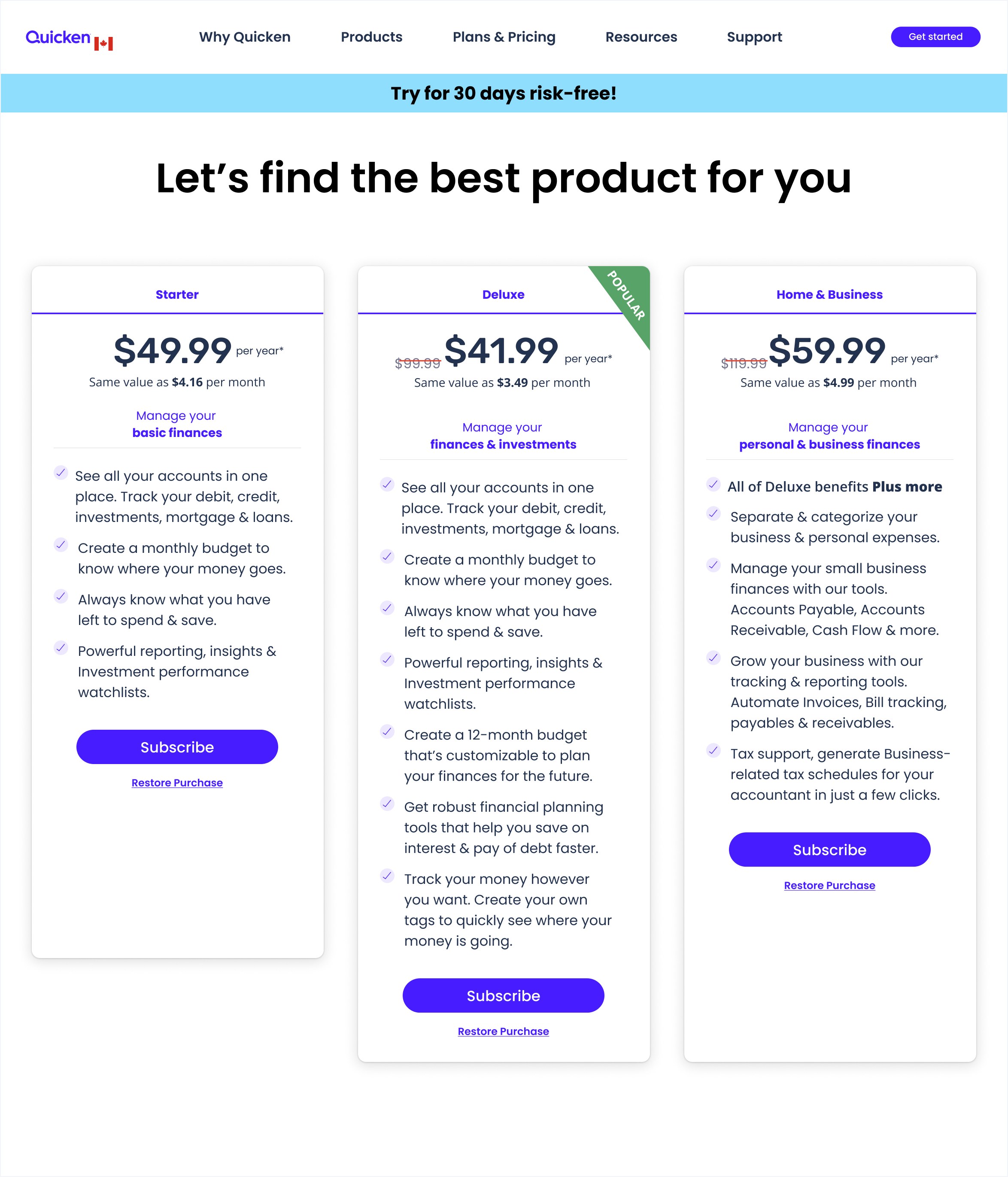
New plan & pricing — Desktop
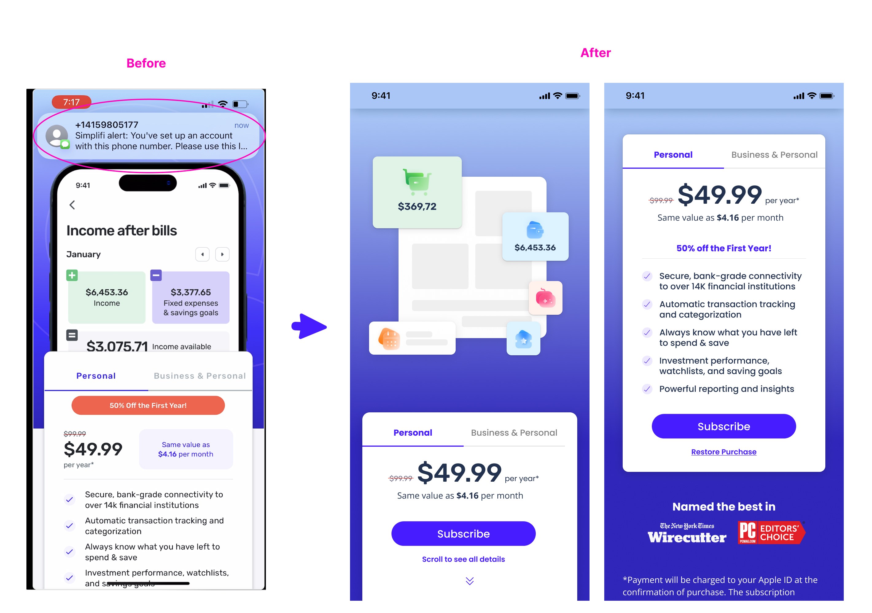
New plan & pricing — Mobile
Problem 2
An interruption in the onboarding flow
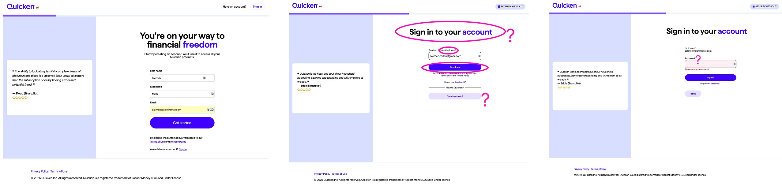
After choosing a package, when a user tried to sign up for the first time, the second onboarding screen had three issues: an incorrect message, a repeated ask for the user's email, and an incorrectly prioritized CTA. It looked like the second screen wasn't designed for first-time users.
UX Improvements
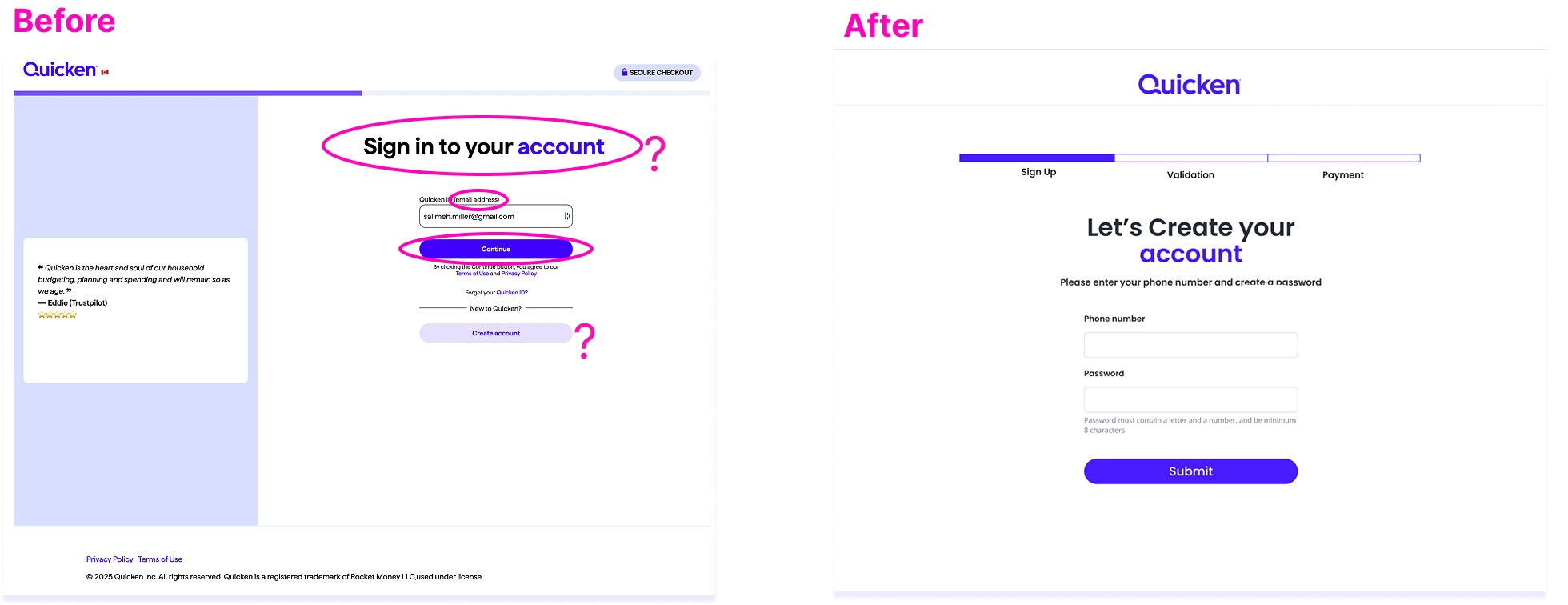
We dedicated a page to first-time users creating an account and onboarding
- Changed the messaging
- Included only one button
- Removed the repeated step (asking for email twice)
Lack of Clear Communication
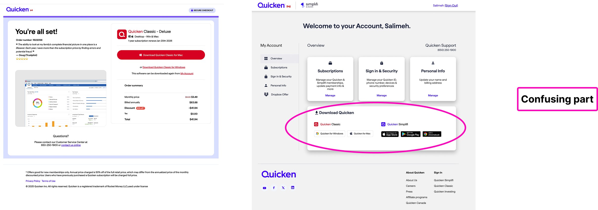
Brand inconsistency resurfaced in software adoption
After the user completed the payment for the account they had just created, the web browser suggested downloading the software and presented both versions, Quicken Classic and Simplifi. When the user downloaded Simplifi by mistake, they were still able to log in — a flaw that led to sync issues.
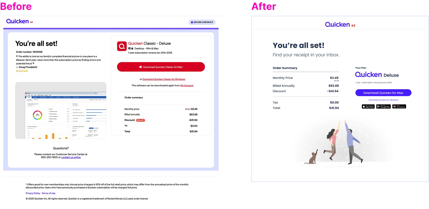
UI Improvements to the Adoption Flow
- Used a consistent brand colour for both versions — differentiated only by the packages that fall under each one
- Made Quicken Classic the only option available for download, since Simplifi doesn't work for Canadians
- Removed the option to download Quicken Simplifi for a user who just signed up for Quicken Classic, since that would be confusing
Problem 3
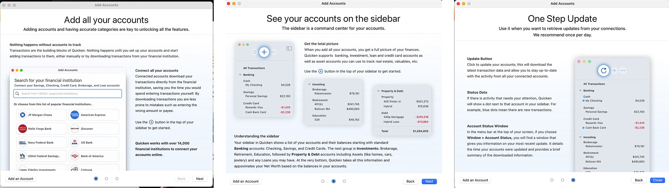
Overwhelming screenshots on the intro screens
The user was presented with a lot of information at once — it was hard to focus their attention on a specific area, and it wasn't the best way to teach them how to use the software.
These were trying to teach people how to add accounts, read the sidebar, and update in one step.
2 UX Approaches to Fix the Issue
Instead of asking users to learn & remember Quicken, we guided them through each step
Guide, don't overload
Showed how to add accounts minus all the extra info that wasn't necessary at this stage, and redesigned the dashboard to make it more digestible, organized, and delightful to use.
Approach to iterations
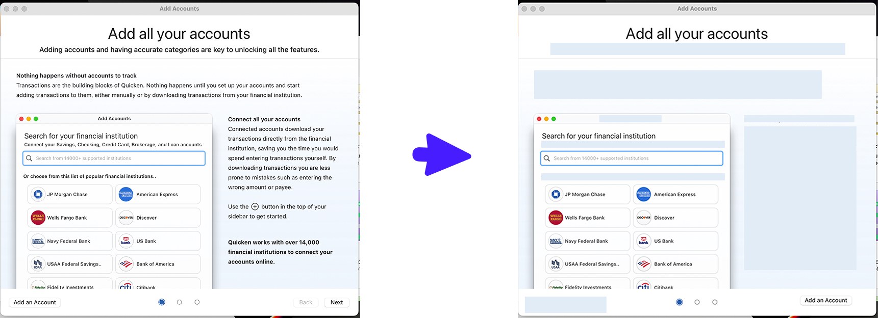
Simplified the screens by covering the text details, added interaction on slides (like a GIF), broke down the content instead of novelizing it, and added a hierarchy of info using type size and weight to focus attention.
From cluttered to simple (lo-fi version)
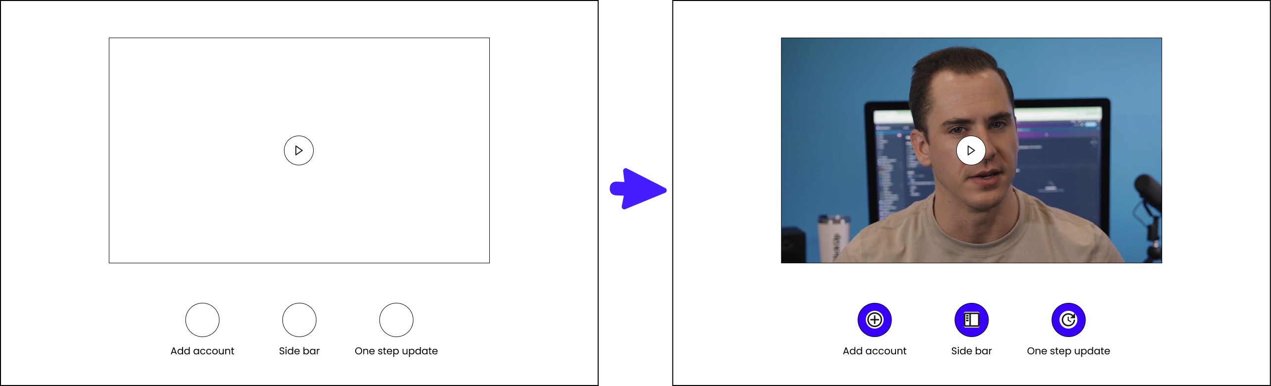
Iterations for the next intro screens
We created an interactive onboarding video users could click into, choosing which feature they wanted to learn about via tabs.
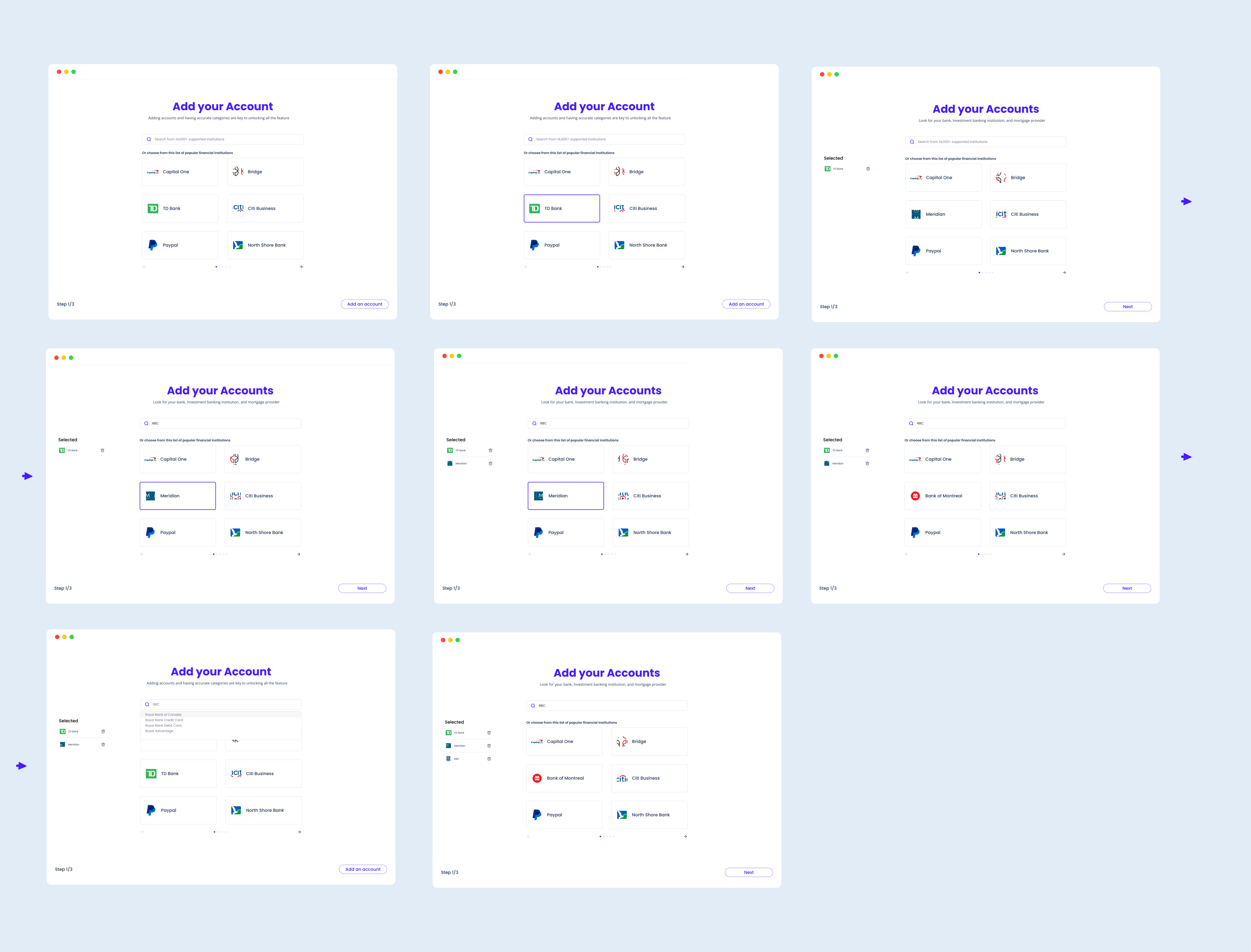
New Onboarding Experience
Step by step, adding accounts became lighter and clearer
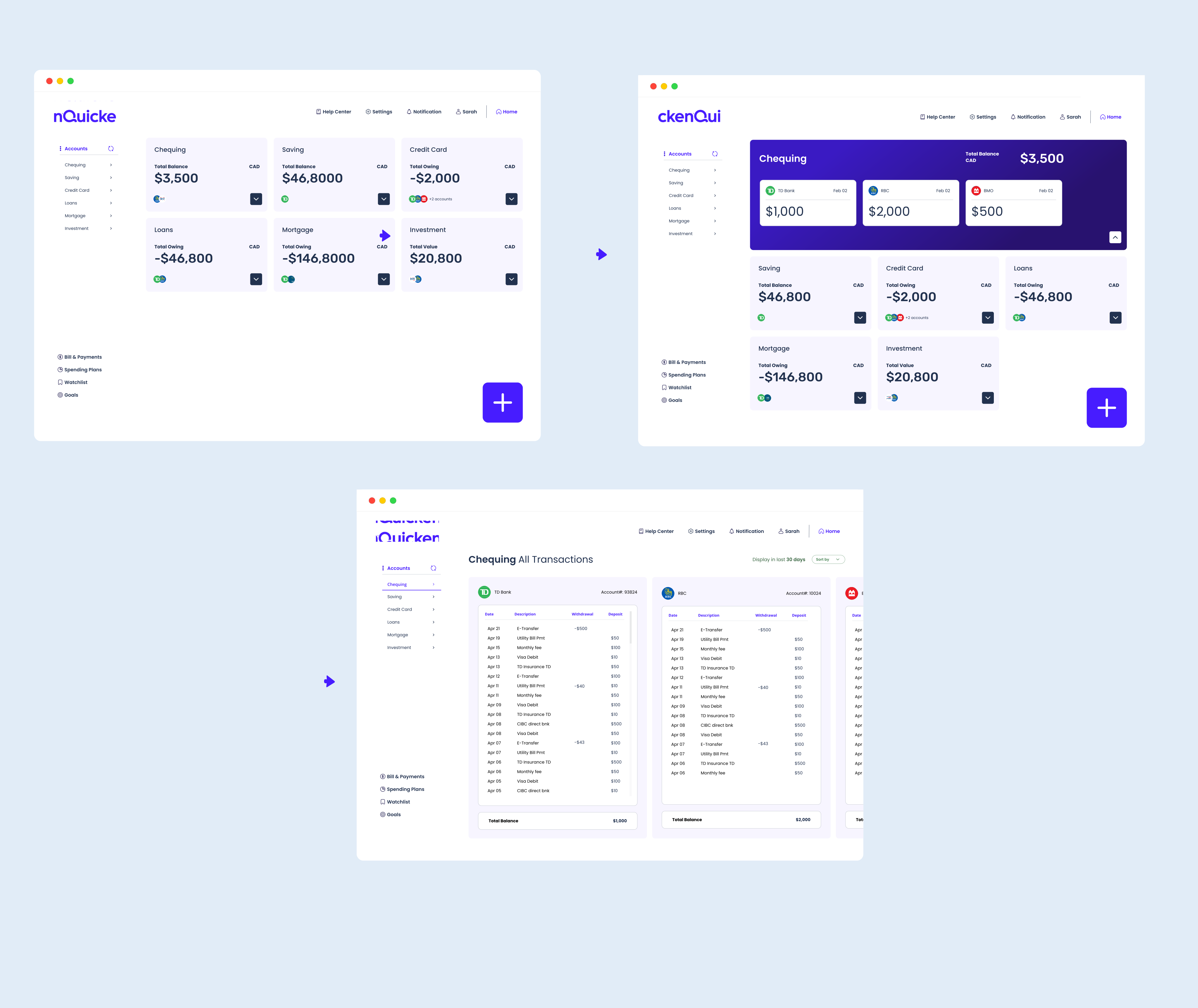
New Dashboard
Here's how we simplified the dashboard design
To take it a step further, we studied and analyzed ways to improve the dashboard and redesigned it to help users scan their financial info quicker and easier.
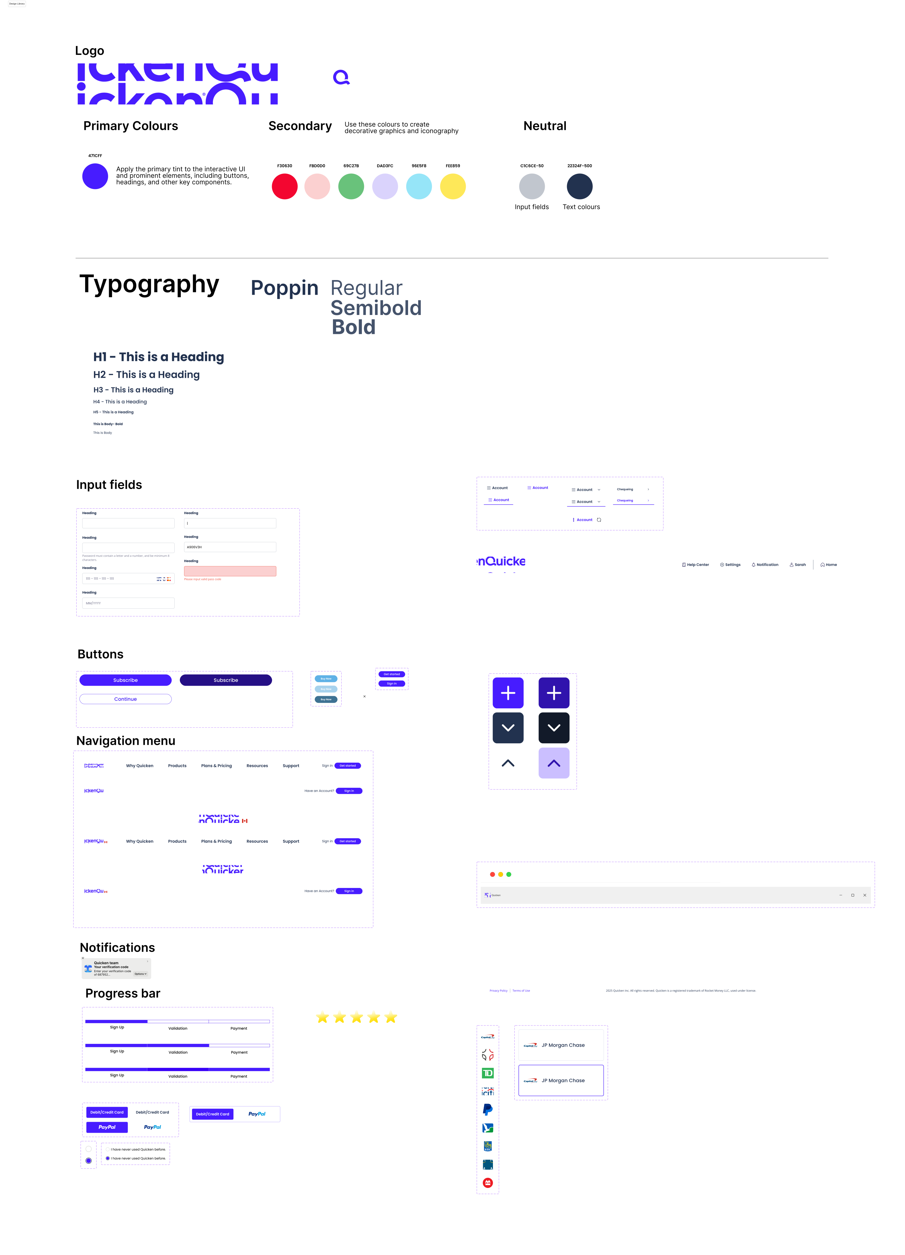
Bringing It to Life
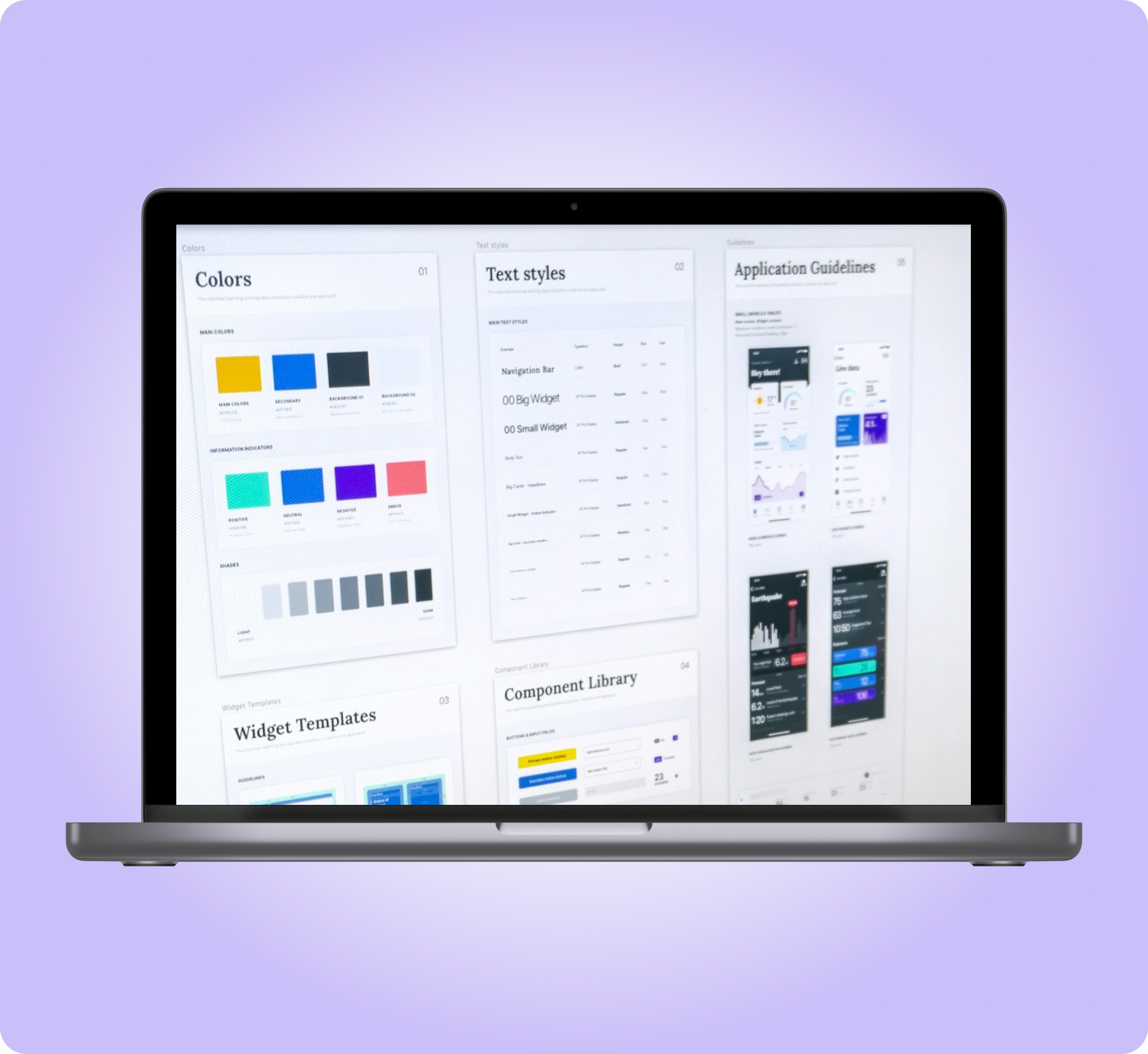
We built a design library to keep the new system consistent
Reflection
Final thoughts
Brand inconsistency wasn't just a visual issue — it followed users from the pricing page, through sign up, all the way to software adoption, undermining trust at every step.
A first-time user shouldn't have to work to prove they're new. Removing the repeated ask and fixing the messaging on that second screen made the sign up flow feel like it was actually designed for them.
Teaming up with another designer on a passion project outside of assigned work gave us the room to build the case for brand consistency, sign up, and onboarding improvements from the ground up.